Cookbook
Short, copy-pasteable recipes. Each is self-contained — import melanopy as mp and go. For the
functions they draw on, see the API reference.
Rank a set of colormaps
melanopic_ratio is the M/P mean — where a map sits (display white = 1.0; under 1
protective, over 1 alerting); mp_spread is the M/P spread (σ) — how tightly it sits.
import matplotlib.pyplot as plt
import numpy as np

import melanopy as mp

for name in ["copper", "magma", "viridis", "cool", "gray"]:
    c = plt.get_cmap(name)(np.linspace(0, 1, 256))[:, :3]
    s = mp.rate_colormap(c)
    print(f"{name:8s} M/P={s['melanopic_ratio']:.2f}  spread σ={s['mp_spread']:.2f}")
copper   M/P=0.49  spread σ=0.03
magma    M/P=0.72  spread σ=0.53
viridis  M/P=0.83  spread σ=0.56
cool     M/P=2.06  spread σ=0.58
gray     M/P=1.00  spread σ=0.00
Read a colormap's melanopic profile
The mean and spread summarize a curve. Ask for it with profile=True to see where a map dumps
its blue — viridis spikes at the dark end (high σ, "smeared") while copper and gray stay flat
(low σ, "pure").
import matplotlib.pyplot as plt
import numpy as np

import melanopy as mp

for name in ["viridis", "copper", "gray"]:
    c = plt.get_cmap(name)(np.linspace(0, 1, 256))[:, :3]
    p = mp.rate_colormap(c, profile=True)  # adds positions / ratios / luminance
    print(f"{name:8s} σ={p['mp_spread']:.2f}  dark-end M/P={p['ratios'][10]:.2f}  "
          f"mid M/P={p['ratios'][128]:.2f}")
viridis  σ=0.56  dark-end M/P=3.06  mid M/P=1.21
copper   σ=0.03  dark-end M/P=0.70  mid M/P=0.47
gray     σ=0.00  dark-end M/P=1.00  mid M/P=1.00
To plot the full curve, use p["positions"] (the [0, 1] data grid) against p["ratios"]:
import matplotlib.pyplot as plt
import numpy as np

import melanopy as mp

fig, ax = plt.subplots()
for name in ["viridis", "copper", "gray"]:
    c = plt.get_cmap(name)(np.linspace(0, 1, 256))[:, :3]
    p = mp.rate_colormap(c, profile=True)
    ax.plot(p["positions"], p["ratios"], label=f"{name} (σ={p['mp_spread']:.2f})")
ax.axhline(1.0, ls=":", color="grey")  # display white = 1
ax.set(xlabel="data value", ylabel="melanopic ratio (M/P)", ylim=(0, 2))
ax.legend()
plt.show()
Sweep the Circadia family
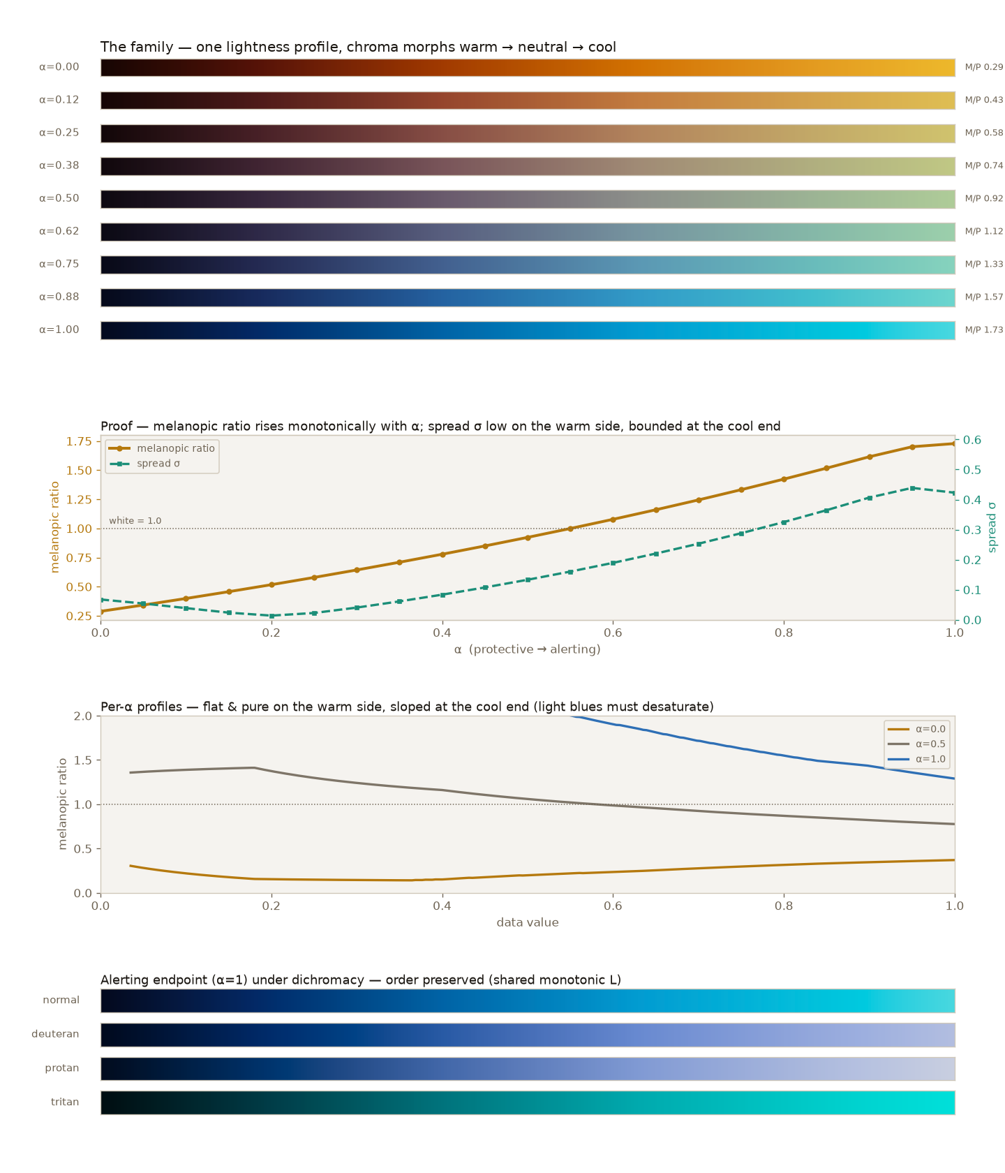
mp.circadia(alpha) walks the axis from protective (alpha=0) to alerting (alpha=1) while
holding lightness uniform. Rating each step shows the melanopic ratio climb monotonically — the
dial is an emergent property of the OKLab geometry, not a knob the generator sets.
import numpy as np

import melanopy as mp

for a in np.linspace(0, 1, 5):
    ratio, spread = mp.circadia_rating(a)
    print(f"alpha={a:.2f}  M/P={ratio:.2f}  spread={spread:.2f}")
alpha=0.00  M/P=0.29  spread=0.07
alpha=0.25  M/P=0.58  spread=0.02
alpha=0.50  M/P=0.92  spread=0.13
alpha=0.75  M/P=1.33  spread=0.29
alpha=1.00  M/P=1.73  spread=0.42
Label a live α-slider with its rated M/P
α is a control — a geometric position on the OKLab morph — not the melanopic ratio the viewer
receives, and that ratio is panel-dependent. mp.circadia_rating(α, panel=...) composes the
generator and the rater in one call, so a slider can label itself with the physical number for its
configured panel. Drag the slider, call im.set_cmap — never recompute the data.
import matplotlib.pyplot as plt
import numpy as np
from matplotlib.widgets import Slider

import melanopy as mp

PANEL = "representative"  # prefer a measured panel for research use — see the API reference

z = np.add.outer(np.sin(np.linspace(0, 6, 200)), np.cos(np.linspace(0, 6, 300)))
z = (z - z.min()) / (z.max() - z.min())

fig, ax = plt.subplots()
fig.subplots_adjust(bottom=0.2)
im = ax.imshow(z, cmap=mp.circadia(0.0, as_cmap=True), aspect="auto")


def relabel(a):
    ratio, spread = mp.circadia_rating(a, panel=PANEL)  # the rated, panel-aware M/P
    ax.set_title(f"α = {a:.2f}  →  M/P = {ratio:.2f}  (σ = {spread:.2f}, {PANEL})")


def on_change(a):
    im.set_cmap(mp.circadia(a, as_cmap=True))  # recolour the fill; never recompute the data
    relabel(a)
    fig.canvas.draw_idle()


sax = fig.add_axes([0.2, 0.06, 0.6, 0.04])
slider = Slider(sax, "α", 0.0, 1.0, valinit=0.0)
relabel(0.0)
slider.on_changed(on_change)
plt.show()
The initial title reads α = 0.00 → M/P = 0.29 (σ = 0.07, representative). The SMACC reference
app does the same through the pyqtgraph adapter (melanopy.adapters.pyqtgraph).
Accent marks over a circadian fill
Overlaying ticks, points, or event lines on a Circadia fill? CIRCADIA_ACCENT holds vivid colours
chosen to sit outside the family's colour footprint — so they pop over a warm or a cool fill —
and to stay distinct under colour blindness.
import matplotlib.pyplot as plt
import numpy as np

import melanopy as mp

z = np.add.outer(np.sin(np.linspace(0, 6, 200)), np.cos(np.linspace(0, 6, 300)))

fig, ax = plt.subplots()
ax.imshow(z, aspect="auto", cmap=mp.circadia(0.0, as_cmap=True))  # warm Sodium fill
for i, color in enumerate(mp.CIRCADIA_ACCENT):  # event markers that stay legible over it
    ax.axvline(40 + i * 45, color=color, lw=2.5)
plt.show()
Match the map to the data
The melanopic axis can carry the data's meaning, not just score it. When the data is itself
circadian, let the alerting end mark wakefulness and the protective end mark sleep, and the map's
melanopic axis is the sleep–wake axis. Reach for the sequential circadia_sweep for an
unsigned state (asleep → awake), and the diverging circadia_diverging for a signed quantity
(sleep-promoting ↔ alerting, neutral at the zero crossing).
import matplotlib.pyplot as plt
import numpy as np

import melanopy as mp

# Wakefulness 0 (asleep) .. 1 (awake) over a noon-to-noon day, for two weeks.
hours = np.linspace(12, 36, 144)
days = np.arange(14)[:, None]
rise = 1 / (1 + np.exp(-2.6 * (hours - (23.2 + 0.11 * days))))  # asleep in the evening
fall = 1 / (1 + np.exp(-2.6 * ((31.4 + 0.04 * days) - hours)))  # awake the next morning
wake = np.clip(1 - rise * fall, 0, 1)

# Sequential: cool = awake (alerting), warm = asleep (protective).
plt.imshow(wake, aspect="auto", cmap=mp.circadia_sweep(as_cmap=True), vmin=0, vmax=1)
plt.show()
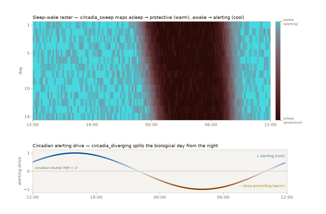
The full two-panel figure — including the circadia_diverging alerting-drive curve — is
reproducible with uv run scripts/build_sleep_wake_demo.py.